

Brand Identity Unfolded: Twenty Two Zines’ Bold New Look

At Otherwhere Creative, we are all about embracing the whimsical, wonderful, and unique. Our work lives right at the intersection of personalized touch, creative craft, and utmost curiosity. We thrive where imagination blooms, ideas run wild, and design feels deeply human.
So when an email dropped into our inbox inquiring about our brand identity design services, we knew that we wanted to do something special for our soon-to-be client, Twenty Two Zines. They run a zine distro which serves as a hub for DIY and zine enthusiasts alike. Looking through their distro, you can see how wonderfully creativity spills off the pages and into the hands of a growing community. What we love the most is that they did not just sell zines, they cultivated and nurtured them, as well. Above all, Twenty Two Zines teaches their community how to create them. Think: art, rebellion, education, and camaraderie; all bound together with passion.
We found their existing branding to be beautifully charming with its handmade aesthetic and personally crafted appeal. They first approached our brand designer after stumbling upon her YouTube channel, where she discussed graphic design and educational content. They reached out to us to not completely change their identity, but to refresh it. Twenty Two Zines wanted a more polished, professional, and versatile look without losing the heart of their spunky, DIY spirit.
Seeing their art and inspired passion for what they do, we immediately grew intrigued. Zines being born from resistance, freedom, and self-expression? Those values definitely pulsed right through our own creative DNA. For us, this is not merely a brand identity services project. It was a love letter to zine culture and passion.
The Discovery: Getting to the Heart of the Brand

For us here at Otherwhere, every project starts with curiosity. We begin with, “what brand is this” and further trail into every nook and cranny of their identity, vision, and direction. Our first step was scheduling an initial discovery call with the client. With this, we do not simply aim to discuss a brand identity presentation structure or process; we aim to dive deep into what the business is really about. Through this, we can learn more about their brand, but more importantly, we can assess if we can give them the results that they deserve. After all, our projects are centered on giving the absolute best brand identity and design service to our clients, whom we value the most.
They shared their love for zine culture, with how it allows freedom and self-expression to their community. Zines have always been a playground for ideas, protests, subcultures, and voices that refuse to just fit neatly between the lines. Whether it’s punk manifestos or poetic pamphlets, zines have always been the heart of creativity and passion. That spirit of “publish first, permission never” became a guiding principle for us. It wasn’t just a slogan—it was a creative manifesto.
We also learned about their audience: creators, educators, and lifelong DIYers who saw zine-making as both an art form and an act of resistance. This was a community that valued authenticity over perfection, voice over polish, and participation over prestige.
After that call, we knew we had found kindred spirits. We did not want to just be a brand identity agency for Twenty Two Zines; we also want to be their collaborator and design partner.
So we moved into one of our favorite parts of the process: the Client Workshop.
The Workshop: Deep Dive into Concept

After the initial spark comes the structure. This is the part where we come up with ways to create a concrete plan for the brand identity and inspiration. In this phase, we unpack the brand’s goals, audience, operations, and even quirks. We ask questions that dig beneath the surface to pave the way for creative excavation and collaborational magic.
For Twenty Two Zines, our workshop session was a riot of inspiration. We had a deep conversation that lasted for hours and were struck with admiration for the client’s passion about what they do and why they do it. They discussed the importance of community, accessibility, and even the tactile joy of creating art with your own hands, mind, and heart.
We delved into their mood board, which was overflowing with nostalgic Y2K textures, handmade collage aesthetics, and even a touch of witchy symbolism. There were photocopied stars, doodles in the margins, snippets of handwriting, and the unmistakable feel of something made by hand. All in all, it screamed personality.
At Otherwhere, that’s exactly what we wanted their brand to do: scream out its passion and identity. And so, we wanted to incorporate brand identity examples and draw inspiration from their punk, DIY, and delightfully unique spirit. After all, branding Identity does not only center on visuals. It also tackles strategy and ensures that their identity resonates with their target audience and captures the kind of service that they provide. Zine-making is a craft and art. So, we wanted the logo to look like it could have been cut and pasted straight from the pages of a publication. The textures should feel real, and the typography should whisper “made with love and a bit of chaos”. We wanted Twenty Two Zines’ brand to feel alive and moving.
We also go beyond merely preparing brand identity package samples for our clients. Such as with the case of Twenty Two Zines, we provided a transcript of our conversation to the client so that they can also use it with their business plan. After all, our discussion touched on what they help to solve with their designs, consisting of a deep dive into their target audience, and how they aim to frame the brand with its future direction in mind. We always aim to give the absolute best we can to help our clients in every way possible.
The Design: Mixing Magic, Texture, and Personality

Then came the fun part: bringing all the energy and vision we’ve collaborated on to life. We dove headfirst into typography research, where we pulled references from classic punk zines, handmade flyers, or early 2000s printed ephemera. We experimented with mixed lettering, hand-drawn marks, and subtly gritty overlays that celebrated handmade creation in all its glory. We went for collage-style typefaces that feel like something you’d either write in your art journal or cut out of a magazine.
We also did thorough quantitative and qualitative research as we flipped through pages of case studies. Doing so helped us gather the information we needed that not only led us to the right direction in terms of design, but also helped the company further investigate its challenges and even strengths. Indeed, Otherwhere values our clients as we work beyond merely giving the service asked of us. We make sure that we also serve as a valued partner and collaborator that helps the company or client determine how their design or materials can set their brand identity, leading to more sales or drive more engagement towards their products or services.
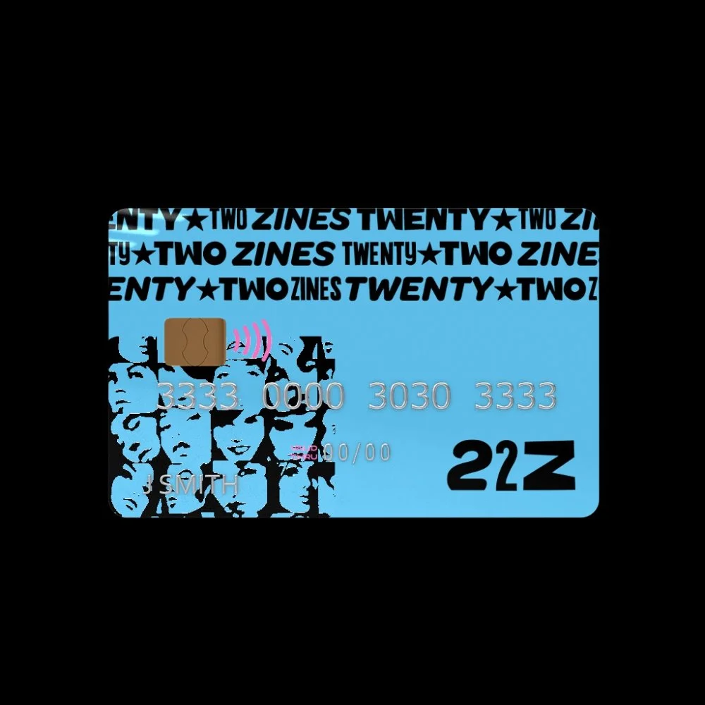
The Outcome: A Collage of Creativity for a Handmade World

The brand identity meaning and outcome for this project reflected and served as an homage to their zine culture; layered, textured, defiant, and one of a kind. It celebrated the diversity of various voices, backgrounds, and ideas that Twenty Two Zines’ community fosters. Every visual element we worked on for the client’s identity design and branding went beyond mere aesthetics. We made sure that every detail had intention. The typography was expressive yet approachable. The color palette was a marriage of deep inks, warm neutrals, and eclectic pops, evoking a sense of nostalgia and energy.
Among our favorite touches was also the incorporation of a star symbol into Twenty Two Zines’ logo. This serves as a nod to their love for Wicca.. This brand identity example exudes how a simple graphic element at first could grow to be a symbol of connection.
Creating a Flexible Visual Identity System
Another unique approach we did for the client was creating a flexible visual identity system. Like their means for having their voices heard and their provision of a wide range of zines, we also want the client to also break out of creative boundaries when it comes to their design and brand identity. We wanted them to have a toolkit of fonts, textures, and color combinations that could remix endlessly without losing cohesion. Similar to a design sandbox, we wanted them to play, experiment, and hold no bars when it comes to expression.
And because our client loved maximalism that screams textures, shapes, drawings, and color explosions, we also leaned all that way in. We treated the process itself the way one does when making a zine: messy, hands-on, full of discovery, and breaking out of creative boundaries. We also made sure to record custom tutorial videos to help show them how to apply the brand, pair elements, match colors, and keep everything consistent. For us, simply handing over a brand isn’t the end game, but instead an invitation and continuous process to keep creating.
Page of Reflection
If there’s one thing that this project reminded us, it is that great branding is not simply about perfection. It is about personality and voice. Coloring outside the lines, not always conforming to societal standards or trends, and being unapologetically you can help set your brand apart and help you drive more engagement or strengthen the ties with your community. Similar to our project with OKNGN Beauty, helping redesign their brand identity while highlighting their inclusivity and community-focused features helped lead us to a design direction that is timeless and most of all, impactful.
At Otherwhere, we firmly believe that design should invite people in most of all with its quirkiness, authenticity, and edge. Working with Twenty Two Zines reminded us that design is not just a visual language, but is also a form of connection. When done right, a brand goes beyond just representing a business as it also evolves into a celebration of curiosity, courage, and a dash of creative chaos.
After all, creativity - like a good zine - is meant to inspire and empower.
Looking to refresh your brand identity? At Otherwhere, we’re here to help you reimagine your look and communicate your story with clarity and impact. Connect with us today and let’s start the transformation!